
What Is Pantone? A Guide to the Gold Standard in Color Matching
When you hear designers or printers talk about “Pantone colors,” they’re referring to a global color-matching system that ensures color consistency across printing and manufacturing. The Pantone Matching System (PMS) is a standardized color language used in branding, packaging, fashion, and virtually every industry that relies on precise color reproduction.
At Ewan Printing, we use Pantone as a vital tool to ensure brand colors print accurately and consistently—every time.
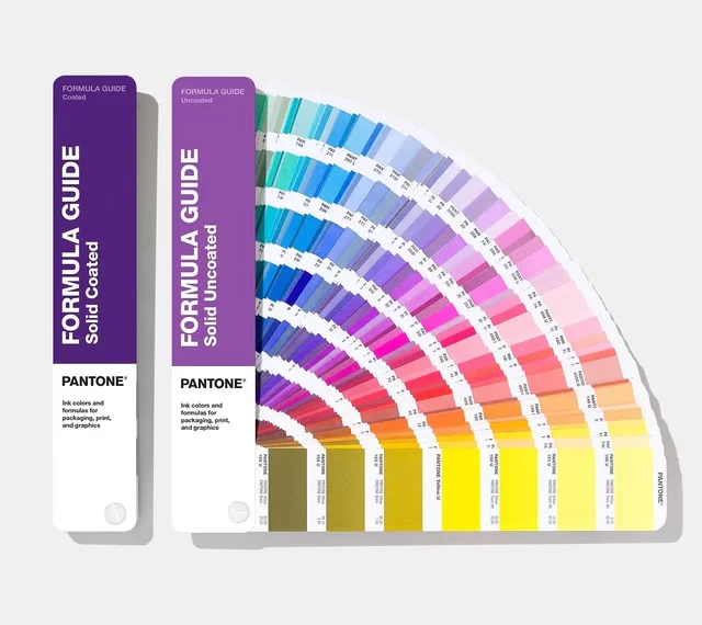
What Is the Pantone Matching System?
Developed by the Pantone company in the 1960s, the PMS assigns each color a unique number (like PMS 186 C, a bright red) that corresponds to a precisely mixed ink formula. These colors can be used across various media and materials to ensure that what you see on screen or proof is what you’ll see in the final print.
Pantone colors are often used in spot color printing—where a single, pre-mixed ink is applied to paper, rather than creating the color from standard CMYK ink combinations.
Why Pantone Matters in Printing
| Feature | Benefit |
|---|---|
| Color Accuracy | Ensures colors match exactly across different printers, materials, and geographies. |
| Brand Consistency | Vital for companies maintaining strict visual identities (e.g., Coca-Cola red or Tiffany blue). |
| Efficient Proofing | Easy for clients and printers to reference and approve precise colors. |
| Expanded Color Gamut | Pantone includes metallics, fluorescents, and pastel tones not achievable in standard CMYK. |
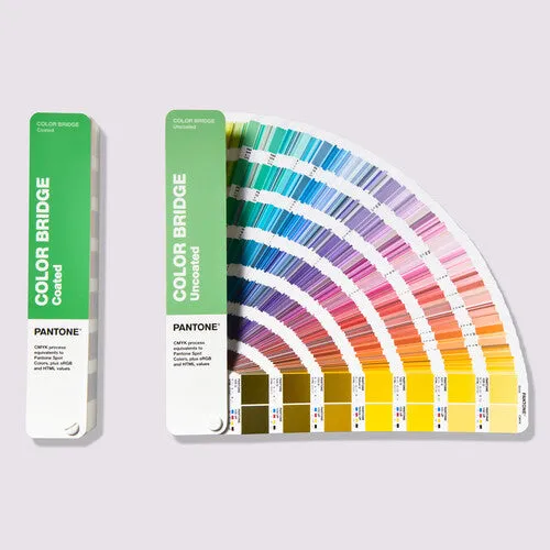
Pantone vs CMYK: What’s the Difference?
| Aspect | Pantone (Spot Color) | CMYK (Process Color) |
|---|---|---|
| Ink Type | Pre-mixed, specific ink | Cyan, Magenta, Yellow, Black blends |
| Color Accuracy | Extremely precise | Can vary depending on paper, press, or calibration |
| Best Use | Brand colors, solid fills, metallics, fluorescents | Full-color photos, gradients, general print work |
| Cost | More expensive per color, especially for small runs | More cost-effective for high-volume full-color printing |
When Should You Use Pantone Colors?
Pantone is ideal for:
- Corporate branding: business cards, logos, packaging
- Spot treatments: accent colors, icons, and brand motifs
- High-impact design: neon signage, metallic finishes, or vivid contrasts
- Color-sensitive products: fashion catalogs, product packaging, and cosmetics
Even in CMYK print jobs, designers often specify Pantone equivalents for color reference during proofing and calibration.
Ewan Printing and Pantone Precision
At Ewan Printing, we work with Pantone color guides and calibrated equipment to match your vision to reality. Whether you’re printing offset, flexo, or digital, our team ensures your brand colors appear just right. We offer:
- Pantone spot color printing for packaging, stationery, and specialty jobs
- CMYK + Pantone hybrid printing for both vibrant imagery and consistent branding
- Color consulting to help select the perfect Pantone match for your brand or campaign
Final Thoughts
Pantone isn’t just a color system—it’s a global standard that protects brand integrity and ensures visual impact. Whether you’re printing marketing materials, product packaging, or corporate collateral, Pantone is how professionals speak the language of color.
Need help finding or matching the perfect color?
Talk to our team at Ewan Printing—we’ll help you choose the right Pantone or CMYK setup to bring your print project to life, beautifully and accurately.
The most trusted and quality printing company, with excellent customer service. Best Quality Printing in Dubai
#EWANPRINTING
WhatsApp/Call us:
Arabic: 055 5771552
Arabic & English: 056 5071752 – (Send Query) https://wa.me/message/ZCPEMGR67ZD6G1
English | Urdu | Hindi: 050 508 6855
For latest offers
Email: printingewan@gmail.com
Location: Shop 26 and 28, Al Nasiriya Building, 247 Damascus Street, Al Qusais Industrial Area 1, Dubai, UAE
Leave a Reply